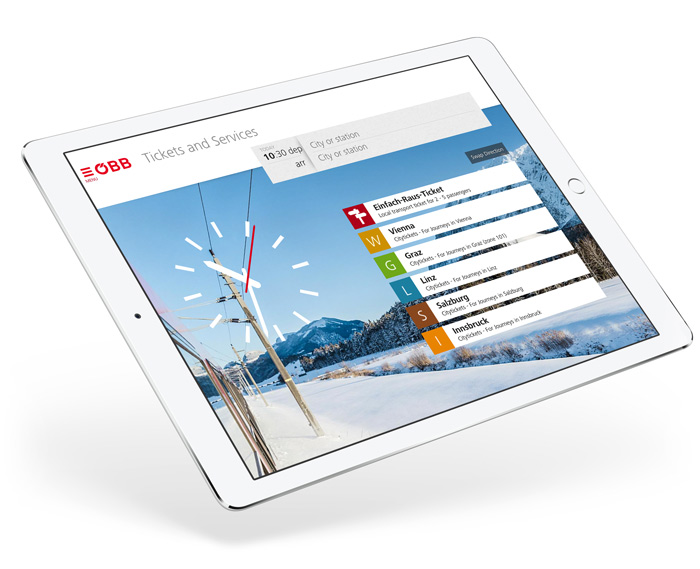
Illustree for ÖBB3 min read How we make it easy
to use Austrian rail
The ÖBB App:
Timetable, ticketing and digital travelling companion: With the ÖBB app customers can plan and book their trips as quickly and effortlessly as never before.
Mobile Ticketing
completely re-thought
My goal is that a regular customers needs no longer than five seconds to buy a ticket. How you make this happen is totally up to you!Georg Lauber Member of the board of directors ÖBB Personenverkehr AG

A smart tool for smart customers:
Fast, simple and always up-to-date.
Ticket purchase faster than ever. The timetable as clear as no other. And a travelling companion that always knows which information is currently needed.

All expectations have been exceeded
+70 %
more tickets sold through the app just three months after launch
+112 %
mobile tickets tickets sold during the first year
My personal travelling companion
The ÖBB don't let their customers down. For with the ÖBB app each traveller has a digital companion that thinks and learns along with him while en route.
My Startscreen
When opening the ÖBB app, I can see what I need time and time again: My tickets. My trips. My favourite routes.


“Me” and my travelling companions
The ÖBB app remembers with whom I travel - including the reductions. And always offers the most reasonable price.
The 2-Cick-Ticket
Tap “favourite route” on your startscreen, then tap “buy”, that's it. We have made Europe's fastest mobile-ticket come true.

Whoever uses public transport in Austria, needs nothing else.
User experience, product design and positioning in correlation: Our aim was a service design that would transcend the limits of the screen. With the ÖBB app, ÖBB establish themselves even more firmly as modern service providers, while at the same time significantly increasing customer satisfaction.
Thinking big. Testing meticulously. Delivering Innovation.
Our mission: An overall concept for a new ÖBB app, which should cover all services around the journey.
Together with our partner moodley brand identity we developed the positioning of the ÖBB app and designed all graphic elements and screens.
The more visionary a concept, the more important its is to have convincing proofs-of-concept: We programmed prototypes, carried through usability-tests with eye-tracking and improved design and workflows in several stages. Thus we secured that the concepts are accepted by the rail customers.
Unique in Europe: The Story of the Undo-Button
The idea: Cancelling a ticket purchase is now very easy for all users: all that is necessary is it needs is one touch of button.
Service design on a new level. This, however, involves a complex process for the ÖBB: Money must be paid back, delivered tickets must be “retrieved” and reservations cancelled. Our client was nevertheless convinced by this idea. For this unique feature proves how ÖBB define customer service in a completely new way: as a sign of authentic good will and real obligation.

Our customers about us.
In Illustree we have found a design partner that lead us to a point, to which we, a(s a) company that has grown over a long period, probably never would have get all alone.
 Georg Lauber Member of the board of directors ÖBB Personenverkehr AG
Neat and clean. The first thing you notice is the neat and clean design of the user interface. From the start page, it only takes one tap to get to the schedule, and you can view recently searched routes without re-typing them.
 AndroidMag.de Technics-lifestyle magazine CDA Verlags- und Handelsges.m.b.H
Gold Award
from International Institute
for Information Design
 IIIDaward 2017 Category Traffic and Public Transports
Client
ÖBB Personenverkehr AG
Overall Lead
David Höller
UX & Concept Lead
Keqiao Xu • Thomas Pfaller • Mike Fuisz
Project Management
Jan Amann • Paul Sommersguter • Christina Kerschner • Birgit Taucher
UX Concept & Design
Jan Amann • Paul Sommersguter • Günther Feldbaumer • Valeria Forlani • Gergö Balla • Barbora Maresova • Alexandra Pexider • Armin Wagner • Thomas Berger • Phil Samhaber • Verena Mitterrutzner • Sebastian Schöndorfer • Wieland Kloimstein
UX Development & Prototyping
Roswitha Wallner • Jan Amann
Wording & Editing
Clemens Stachel • Doris Granegger
Technical Implementation
ÖBB Personenverkehr AG
