Illustree for ÖBB4 min read How pure information introduces a new style on the train
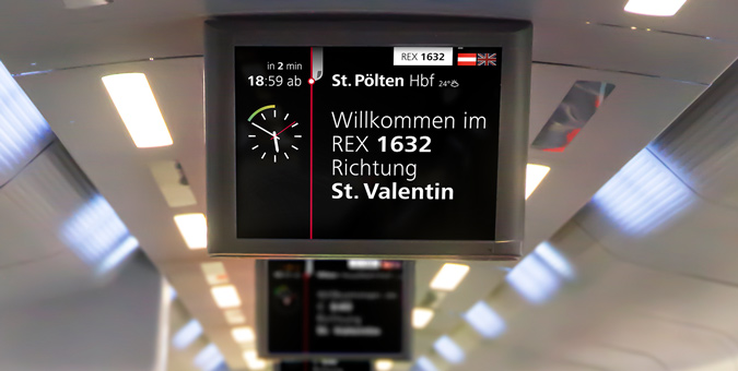
We have developed screens to keep passengers well-informed about their journey and to enhance the interior styling with sleek elegance.
A new information-quality in the carriages.
Clear, concrete, aesthetical. As part of the relaunch of all digital travelling services offered by the ÖBB, it was our task to re-think the onboard infoscreens, to find an informative as well as stylish language of design - in correspondence with our ÖBB app.
The last thing people want to see on the train is obtrusive screens.
No flickering tellies. The times, when infotainment-screens were considered to exude a cool science-fiction-like atmosphere, have long passed. Nowadays people long for quiet places that spare them obtrusive videos.
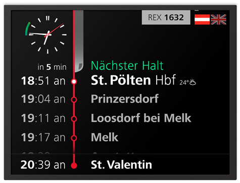
A contribution to the ambience. Infoscreens that always display the accurate information. However, that can be can also be easily ignored, if currently not relevant to one’s journey. And look good at any time!
How can a screen
upgrade the train?
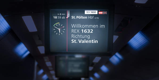
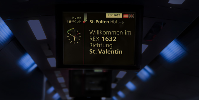
The Night-Mode. When the carriage light is dimmed down in the evening, the infoscreens should not be too overpowering and “pollute” the interior of the train. We have therefore created a special night-mode, which due to its subtle light and warmer colours, does not spoil the ambience, while remaining pleasantly legible at the same time.
With Night-Mode: Dimmed colors
Without Night-Mode: Not dimmed colors
Timeless Information Design.
As a stylish interior element.
Black is the new Black. Big white letters on a black background, which means: a maximum in contrast and high legibility. Barrier-free in accordance with the international AA-standard.
High information quality means:
Relevant information at the right time.
Meaningful information is always well-chosen - and takes into account the current context. We have made sure that the information is always spot-on and the screen never overcrowded.
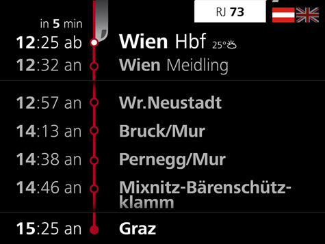
Good service is helpful and forthcoming.
In the case of delays and other disruptions of the railway operations only one thing is of importance to every train passenger: Precise information, clearly expressed. Our screen design presents logical alternatives for a continuation of the journey, thus providing helpful clues for decision-making. And we have worked on an appropriately pleasant tone in our language. So that ÖBB's “Sorry” really does find genuine acceptance.
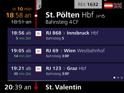
Good Information Design takes into account what the passengers currently need.
The visual “volume” of the screens corresponds with the flow of the train journey. As long as everything runs according to plan, the colours are subtle and the animation discreet. Should any incidents occur enroute, the screens employ strong colours and highly animated visuals to attract attention to the latest information.
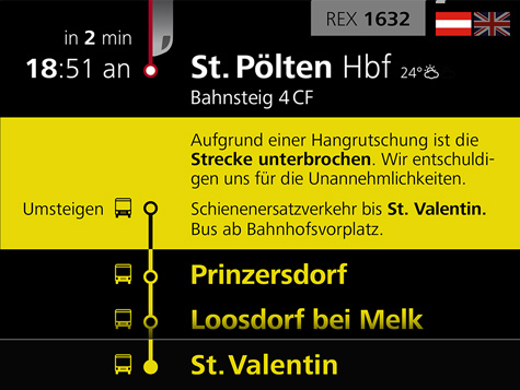
Our customers about us.
For the ÖBB Railjet, Illustree made exactly the right decision: New infoscreens that perfectly provide any travel information needed - and even upgrade the train’s whole appearance.
 Mag. Silvia Kaupa-Götzl Managing Director, ÖBB-Postbus GmbH During Course of the project manager of intercity transport ÖBB Personenverkehr AG
Client
ÖBB Personenverkehr AG
Overall Lead
David Höller
UX & Concept Lead
Keqiao Xu • Thomas Pfaller • Mike Fuisz
Project Management
Jan Amann • Paul Sommersguter • Christina Kerschner • Birgit Taucher
UX Concept & Design
Jan Amann • Paul Sommersguter • Günther Feldbaumer • Valeria Forlani • Gergö Balla • Barbora Maresova • Alexandra Pexider • Armin Wagner • Thomas Berger • Phil Samhaber • Verena Mitterrutzner • Sebastian Schöndorfer • Wieland Kloimstein
UX Development & Prototyping
Roswitha Wallner • Jan Amann
Wording & Editing
Clemens Stachel • Doris Granegger
Technical Implementation
ÖBB Personenverkehr AG

